

Understanding Attribution Modeling: A Complete Guide to Marketing Attribution Models and ROI Optimization
Attribution modeling is the systematic method of assigning credit for conversions and revenue to the marketing touchpoints that influenced a customer’s decision, enabling data-driven allocation of marketing budgets and clearer measurement of channel performance. This guide explains how attribution modeling works, compares single-touch and multi-touch approaches, and shows why algorithmic, data-driven attribution is increasingly essential for accurate ROI optimization and marketing performance insights. Many organizations struggle to translate fragmented touchpoint data into actionable decisions because conversion paths span devices, sessions, and offline interactions; attribution modeling provides the mechanism to unify those signals into metrics like CAC, LTV, and ROAS. Readers will learn model types, the data and privacy requirements for machine-learning approaches, step-by-step implementation guidance, and practical tactics to overcome common pitfalls such as data gaps and cross-device matching. The article covers: what attribution modeling is and its role in defining marketing success, a clear comparison of model types, how AI-driven attribution operates, an actionable implementation checklist, tangible business benefits, and how specialized consulting can help with custom model selection and rollout. Throughout, we use terms like marketing attribution, customer journey mapping, and first-party data attribution to connect concepts to real-world measurement and optimization strategies.
What Is Attribution Modeling and Why Is It Important for Businesses?
Attribution modeling is the process that allocates credit for conversions across touchpoints in a customer journey, revealing which channels and messages drive measurable outcomes and enabling better budget allocation. It works by defining touchpoints and attribution windows, then applying rules or algorithms to distribute conversion credit so marketers can quantify the impact of channels on CAC and LTV. Accurate attribution matters because it informs spend decisions, identifies high-impact conversion paths, and reduces waste by shifting investment toward channels that generate incremental value. This leads directly into how models define success metrics and why model selection changes perceived channel performance.
How Does Attribution Modeling Define Marketing Success?
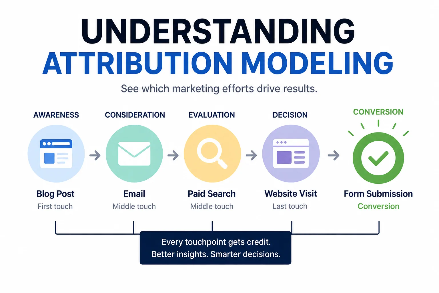
Attribution modeling defines marketing success by mapping conversions back to measurable metrics—such as conversion rate, CAC, ROAS, and customer lifetime value—and by showing which touchpoints move those metrics most. Different models will alter reported performance: a last-click model may overstate paid search while a position-based model highlights top- and bottom-funnel touchpoints, which changes how teams prioritize channels. For example, using a linear model might show consistent mid-funnel credit to display ads, whereas a time-decay model emphasizes recent influences on shorter sales cycles, and that shift in credit changes optimization decisions and KPI targets. Understanding this model-dependent variance helps teams interpret reports properly and avoid misattributing success to the wrong tactics. The next consideration is how the customer journey’s complexity drives the need for multi-touch and data-driven approaches.
What Role Does the Customer Journey Play in Attribution Modeling?
The customer journey—awareness, consideration, decision, and post-purchase stages—determines which attribution models best reflect your buying cycle and touchpoint behavior, because journeys with many touchpoints need multi-touch logic to capture incremental influence. Complex journeys that include content engagement, multiple sessions, and cross-device interactions require models that can weight early, middle, and late-stage signals appropriately; otherwise, you risk undervaluing awareness or nurture activities that enable later conversions. A simple journey (single session, short cycle) can sometimes be measured with single-touch models for speed, but as journeys lengthen and diversify, algorithmic models that use event-level and CRM data provide more accurate credit assignment. Proper journey mapping informs the choice of attribution window, deterministic identifiers, and the necessary data integration approach for reliable measurement.
What Are the Different Types of Marketing Attribution Models?
Attribution models range from simple rule-based single-touch methods to sophisticated multi-touch and data-driven systems, each with distinct weighting logic and trade-offs between interpretability and accuracy. Single-touch models (first-click, last-click) assign all credit to one touchpoint and are easy to implement but ignore multi-step influence. Multi-touch rule-based models—linear, time decay, position-based (U-shaped, W-shaped)—distribute credit across touches based on predefined weights and are useful for balancing influence across the funnel, though they rely on assumptions that may not match real user behavior. Data-driven attribution uses statistical or machine-learning models to infer credit from historical event-level data, offering adaptive accuracy but requiring more data and infrastructure. Choosing a model depends on business goals, sales cycle length, data availability, and the need for explainability versus predictive accuracy.
This section includes a comparison table that summarizes core principles, best use cases, and limitations for quick reference.
Different attribution models vary by principle, best-fit use cases, and common limitations.
| Attribution Model | Core Principle | Best Use Cases / Pros | Limitations / Cons |
|---|---|---|---|
| First-Click | Assigns full credit to the first recorded touch | Useful for awareness-focused campaigns and simple funnels | Ignores later influencing touches; overvalues early activity |
| Last-Click | Assigns full credit to the final touchpoint | Simple reporting and legacy systems alignment | Misses multi-step influence; can over-credit paid search |
| Linear | Splits credit evenly across all touchpoints | Balanced view for multi-touch journeys | Assumes equal impact for every touch regardless of position |
| Time Decay | More credit to recent touchpoints | Short sales cycles where recency matters | May undervalue earlier brand-building activities |
| Position-Based (U-shaped/W-shaped) | Heavier weights for key stages (first, assist, last) | Good for complex funnels with clear milestone interactions | Weight selection is subjective and may need tuning |
| Data-Driven | Uses algorithms to infer credit based on data | High accuracy and adaptability; quantifies incremental impact | Requires event-level data, computation, and governance |
This table clarifies trade-offs and helps teams select a starting model that aligns with their funnel structure and data readiness. Next, we explore how data-driven methods improve accuracy with AI and machine learning.
How Does Data-Driven Attribution Leverage AI and Machine Learning for Better Marketing ROI?
Data-driven attribution applies statistical models or machine learning to event-level and CRM data to estimate the incremental contribution of each touchpoint, improving ROI decisions by basing credit on observed behavior rather than assumed weights. ML algorithms analyze patterns across thousands or millions of conversion paths to calculate model weights, quantify incremental lift, and surface non-obvious interactions between channels and messaging. The major advantage is adaptive accuracy: as user behavior changes, models update to reflect new patterns, which enhances budget allocation and forecasting. Implementing algorithmic attribution requires reliable event-level tracking, deterministic identifiers where possible, and governance practices to ensure privacy compliance and robust model validation.
Key algorithms and methods used in algorithmic attribution require specific data inputs and provide business-impact insights, summarized in the table below.
Below is a concise reference showing algorithms, the data they need, outputs they generate, and typical business impact.
| Algorithm / Method | Data Required | Output / Insight | Business Impact |
|---|---|---|---|
| Logistic Regression / Probabilistic Models | Event-level click and impression data, conversion labels | Attribution weights, feature importance | Transparent incremental estimates for budget shifts |
| Shapley Value Models | Full-path touchpoint sequences, conversion outcomes | Marginal contribution per touchpoint | Fair credit distribution across channels for ROI decisions |
| Survival & Time-to-Event Models | Timestamps, session durations, conversion windows | Time-based impact and decay rates | Improved timing for retargeting and campaign pacing |
| Gradient Boosting / Tree Ensembles | Rich event, CRM, and contextual features | Nonlinear influence mapping and lift estimates | Higher predictive accuracy for complex funnels |
This table clarifies data needs and expected returns from different algorithmic approaches and sets the stage for discussing the practical data requirements for effective implementation.
What Are the Advantages of Data-Driven Attribution Over Traditional Models?
Data-driven attribution surpasses rule-based models by quantifying incremental effects, adapting to changing behavior, and reducing bias inherent in fixed-weight rules, which yields more defensible budget decisions. It often reveals non-linear channel synergies, such as the combined effect of social and email on conversion likelihood, allowing teams to test reallocations with higher confidence. For marketers focused on ROI optimization, algorithmic approaches can lower CAC and improve LTV forecasting by identifying channels that produce true incremental conversions rather than last-touch artifacts. Implementing these advantages requires investment in data hygiene, consistent identifiers, and an iterative validation cycle to ensure the model’s outputs align with controlled experiments and business intuition.
What Data Is Required for Effective Data-Driven Attribution?
Effective algorithmic attribution relies on event-level tracking across channels, CRM records for user lifecycles, cross-device linkage or probabilistic matching, and contextual metadata like campaign tags and timestamps to reconstruct conversion paths accurately. First-party data—logged website events, authenticated user interactions, and purchase history—is foundational because it avoids third-party tracking limitations and supports deterministic matching. Teams should prepare for common integration challenges such as missing UTM parameters, fragmented offline touchpoints, and consent-driven data reduction; mitigation strategies include server-side tagging, CDP consolidation, and privacy-first tracking architectures. Ensuring data quality and a governed pipeline enables ML models to produce reliable attribution outputs that materially improve marketing decision-making.
How Can Businesses Implement Attribution Modeling Successfully?
Successful implementation of attribution modeling follows a phased process—audit, data collection and enrichment, model selection and testing, rollout, and continuous monitoring—each with clear responsibilities, tools, and validation criteria. Governance is essential: define conversion events, maintain consistent tagging and naming conventions, and assign cross-functional owners from marketing, analytics, and IT to manage integrations. Choosing between rule-based, hybrid, or fully algorithmic models depends on data maturity, technical capacity, and the need for interpretability; pilot projects with controlled experiments help validate model outputs before enterprise rollout. Practical steps also include documenting decision rules, establishing KPI mapping to model outputs, and setting an iterative cadence for recalibration as user behavior and privacy constraints evolve.
The numbered implementation checklist below provides a concise HowTo summary for immediate action.
- Audit tracking: Inventory tags, pixels, and event definitions across channels and platforms.
- Consolidate data: Centralize event-level data into a CDP or data warehouse and reconcile with CRM records.
- Select model: Choose rule-based, hybrid, or data-driven approach based on data readiness and validation needs.
- Pilot and test: Run A/B or holdout experiments to compare modeled attribution with controlled lift estimates.
- Govern and iterate: Assign owners, document processes, and schedule regular model validation and updates.
This checklist outlines clear phases to move from assessment to validated attribution. Next, we present an implementation table that operationalizes responsibilities, tools, and common pitfalls for each step.
| Implementation Step | Responsible Party | Tools / Data Needed | Common Pitfalls |
|---|---|---|---|
| Tracking Audit | Analytics Lead | Tag manager, site audit logs | Missing tags, inconsistent event names |
| Data Consolidation | Data Engineer | CDP, data warehouse, CRM | Fragmented identity graphs, duplicate records |
| Model Selection | Data Scientist / Marketing Analyst | Historical event data, modeling frameworks | Choosing model without validation |
| Pilot & Validation | Analytics + Marketing | A/B testing platform, lift analysis | Confounding variables, short test windows |
| Rollout & Monitoring | Marketing Ops | Dashboards, scheduled retraining | Lack of governance, model drift |
This operational table helps teams assign clear ownership and avoid typical implementation traps. The next section explains how to mitigate data accuracy and privacy challenges during implementation.
What Are the Step-by-Step Processes for Attribution Model Implementation?
Begin with a thorough tracking audit to identify gaps in tags, UTM parameters, and event definitions, then move to data consolidation where event streams are harmonized with CRM records for identity resolution. After consolidation, choose a modeling approach based on data volume and required explainability—start with pilots that compare rule-based outputs to algorithmic estimates and validate using lift tests or holdouts. Following a successful pilot, roll out the model incrementally with proper documentation, dashboards for stakeholders, and retraining schedules to handle behavioral shifts. Each phase should include KPIs such as match rate, model confidence, and incremental lift to measure progress and justify further investment.
How Can Challenges Like Data Accuracy and Privacy Be Overcome?
Address data accuracy by instituting consistent naming conventions, server-side event collection, and regular data quality checks that track missing events and duplicate identifiers, while privacy can be managed through consent-first architectures and reliance on first-party data. Where deterministic cross-device matching is unavailable, use probabilistic techniques combined with aggregated reporting to preserve utility without violating user privacy. Implement privacy controls like data minimization, hashing of identifiers, and retention policies aligned with regulations such as GDPR and CCPA. These mitigation strategies preserve analytical value while reducing legal and ethical risk, enabling robust attribution insights even in constrained data environments.
What Are the Key Benefits of Using Marketing Attribution Models?
Marketing attribution models provide concrete benefits: improved marketing budget allocation, clearer understanding of channel contribution to conversions, and the ability to design experiments and personalization based on identified high-impact touchpoints. By revealing incremental impact across channels, attribution enables reallocating spend toward tactics that lower CAC and raise ROAS, resulting in measurable ROI improvements. Attribution also surfaces bottlenecks in conversion paths so teams can prioritize CRO, message sequencing, and funnel optimization to increase conversion rates. These strategic advantages make attribution a cornerstone of performance marketing and long-term measurement frameworks.
Below are primary business benefits mapped to expected outcomes and tactical actions.
- Smarter Budget Allocation: Allocate spend to channels that demonstrably drive incremental conversions.
- Lower CAC & Higher ROAS: Identify and invest in efficient acquisition paths to reduce cost per acquisition.
- Conversion Path Optimization: Eliminate friction points and optimize messaging based on touchpoint performance.
These benefits translate into concrete experiments—such as reallocating display to mid-funnel content or increasing spend on channels that show positive incremental lift—leading to improved financial metrics.
How Does Attribution Modeling Improve Marketing ROI and Budget Allocation?
Attribution modeling improves ROI by assigning incremental credit that reveals which channels truly drive conversions, enabling teams to reallocate budgets from low-impact to high-impact channels and campaigns. For example, attributing credit more accurately to content marketing or email nurtures can justify increasing investment in those channels, which often have lower CAC and higher LTV than paid search when measured holistically. Attribution-informed reallocations are typically validated with controlled experiments to ensure observed ROI gains are causal rather than correlational. The result is a measurable lift in ROAS and a decrease in wasted spend, which supports sustainable growth and better forecasting.
How Does Attribution Help Optimize the Customer Journey and Conversion Paths?
Attribution uncovers which touchpoints assist conversions and which represent bottlenecks, enabling targeted tests such as landing page experiments, revised creative sequencing, or adjusted retargeting windows to smooth the path to purchase. By mapping credit across the funnel, teams can identify underutilized mid-funnel assets or over-relied channels at the bottom of the funnel and redesign the journey to increase conversion probability. Attribution insights also support personalization strategies by identifying the most effective messages and timing for specific audience segments, which improves engagement and conversion rates. These optimizations produce iterative performance gains as models are validated and refined.
For organizations that prefer expert support with implementation and interpretation, targeted consulting is often the next logical step after understanding these benefits.
How Can Minding Your Media’s Attribution Modeling Consulting Services Help Your Business?
Minding Your Media provides attribution modeling consulting and implementation services that bridge the gap between technical modeling and marketing decision-making, helping businesses translate data into actionable ROI improvements. Their approach emphasizes custom model design, hands-on data integration, and governance so that models reflect each client’s customer journey and measurement goals rather than relying solely on off-the-shelf tools. By combining strategic measurement planning with practical implementation—such as audit, CDP integration, and validation frameworks—Minding Your Media assists teams in selecting the right model, running pilots, and operationalizing attribution insights into budget decisions. For companies seeking to build reliable measurement and improve digital campaign effectiveness, Minding Your Media offers consultations to assess readiness and recommend tailored next steps.
What Custom Attribution Models Are Available for Different Business Sizes and Industries?
Custom models vary by complexity and are tailored to business size, sales cycle, and industry-specific touchpoints—for example, startups with short sales cycles may start with hybrid rule-based models plus lightweight lift tests, while mid-market and enterprise companies often require full data-driven solutions integrated with CRM and CDP systems. B2B businesses with long, multi-stakeholder sales cycles typically benefit from position-based or W-shaped models that emphasize key milestones, whereas B2C retailers with high-velocity transactions may prioritize time-decay or algorithmic models that capture rapid recency effects. Minding Your Media’s consulting approach focuses on recommending models that fit organizational constraints and provides templates for pilot durations and KPI targets to validate model effectiveness.
Why Choose Expert Consultation Over Automated Tools Alone?
Expert consultation adds value beyond automated tools by providing human judgment in model design, governance, and change management, ensuring that attribution outputs are interpreted within the company’s business context rather than taken at face value. Consultants help align cross-functional stakeholders, validate models against experiments, and implement robust data pipelines that reduce common errors such as tag drift or identity fragmentation. While automated platforms can accelerate calculations, expert partners ensure models are tailored, defensible, and integrated into decision workflows—improving adoption and the likelihood of measurable ROI improvements. For organizations aiming to move from tool-driven reports to strategic, measurement-driven growth, human-led consulting is a practical investment.
For businesses ready to explore consultation, Minding Your Media offers assessments and tailored guidance to help implement attribution modeling that aligns with strategic goals and measurement maturity.